Emulating a Professional Photographer
- Jessica Lavorgna
- Nov 11, 2024
- 1 min read

Explain why you think this is your most successful image
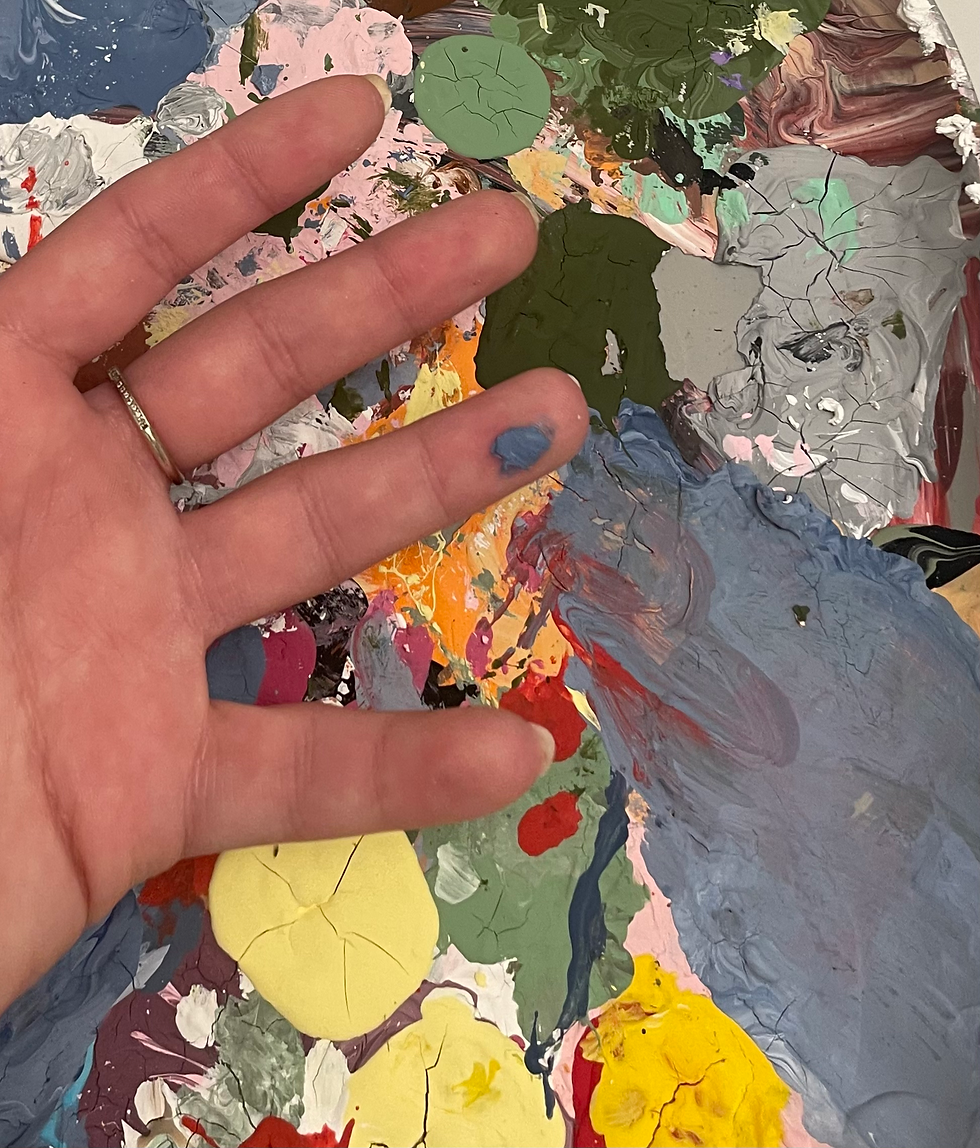
I think this was one of my more successful images because I was able to emulate the photographer while adding my spin on it, instead of the background being blank, I flipped it and had my hand be more barren with the background being more busy, which made this photo one of my favorites.
Tell us what was the most challenging aspect of this assignment
The most challenging aspect was finding an artist that I felt I could emulate but still put my own spin on! A positive aspect of this was that I was able to research and learn about a variety of artists while I was picking a photographer.
Explain what you will do in the future to create stronger images
In the future I will continue to add my spin on my photos but continue learning from the artists that I look up to. The more I learn about how to make art with my photos, the more I am able to bring to my new concepts to my new photos. Angles or subjects or even concepts, I intend to continue my learning of the art and implementing them.

The thing that really draws me to this piece is the paint in the background. It provides a really pretty and unique background with contrasting colors. My eyes are really drawn to the white paint as the paint is dried up and cracked, it provides a lot of detail. The focal point of the hand is really strengthened by the tiny blue splotch of paint which is really eye catching. The photo transports me back to spring and summer since the colors provide such a warm feeling. I really love the concept of the photo it feels really unique.
I was immediately drawn to this image because of its vibrant and textured composition. The palette of mixed colors creates a sense of creative chaos, which complements the subject—your hand with paint on your fingers. The focus is sharp where it matters most, drawing attention to the paint smudges on your fingers, which convey the story of the process behind the artwork. The depth of field is shallow, which works well to isolate the hand and palette while keeping the background minimal and non-distracting. The exposure is balanced, and the color saturation feels authentic without being overdone, making the image visually engaging. It makes me feel a sense of curiosity and wonder about the creative journey that led to this…
Hanna Parikh
I like how you added your own spin on this photo! I think it does a good job of achieving the contrast of the original photo without actually being exactly like it. The colorful background contrasts nicely with the solid color of your hand, and makes your hand stand out. If you played with the zoom settings and saw what it would look like closer up and farther away, I think this could change how much focus is given to the hand vs the background; a super zoomed-out picture might make the hand stand out even more against a larger colorful background. Either way, I think this concept is really cool, great work!
Response by Gabrielle Frasier
Hi Jessica,
I love the images you were able to shoot for our assignment. I was really drawn to this image of yours, as it incorporates similar colors to the work of Viviane Sassen, really embodying her photography as an artist. This photo in specific resonated with me also because I too am an artist, and understand the meaning of the use of color in artwork. I think you were able to capture movement and lighting in an interesting way, as none of the paint strokes are linear, and the lighting used emulates similar lighting to that of your chosen professional. The depth of field and focus compliments the artists, as your hand and the artist's…
https://gabbiejf.wixsite.com/photographywithgf/my-photographic-voice
• Ask yourself why you are drawn to the image?
I was drawn to this image because I too had seen that poster, yet I did not think to photograph it, so its really cool to see how someone else was able to turn it into a photo that is so special.
• What is the main interest in the image and did the photographer compose the subject in an interesting way?
The image was delivering a message in a unique way, yet the quote is not new, but the way it was presented and how the photographer thought to photograph it adds a new layer to it and draws the viewers in.
• Does the depth of field…